Introduction
The circlesplot library helps you display proportions between different objects. Say earth is 3.6 times bigger than the moon. How can you visualize that? It would be helpful if you could draw earth and moon with their exact diameter to make your readers aware of the difference in size. This is where the lib comes into play. It plots two circles with the given diameter next to each other, so readers can observe the ratio. Although it is extremely helpful to visualize planets, it can also be used for other things too.
The first step to visualize proportions will be to include the library:
Usage
Basic plotting
To actually plot something, we need some data and associated labels. Note that both vectors are required and should have the same size.
diameter = c(4879.4,12103.6,12756.3,6792.4,142984,120536,51118,49528)
planets = c('Mercury','Venus','Earth','Mars','Jupiter','Saturn','Uranus','Neptune')
Now we can plot it:
circlesplot(cp_vals=diameter, cp_text=planets, cp_max=4L)Further adjustments
The cp_max parameter is an integer that should be at least 1. It specifies how many circles or planets should be in a row. A cp_max=3L with 8 planets would result in a plot with circles arranged like:
A B C
D E F
G H
A cp_max=4L with 8 planets would result in a plot with circles arranged like:
A B C D
E F G HNOTE: The cp_max parameter is optional. If you leave it blank, it will set the default number of circles in a row to 10.
Color
Now we want to add some color. This can be done via the cp_color parameter. You specify colors like this:
colors = c('#D1BBD7', '#AE76A3', '#882E72', '#1965B0', '#5289C7', '#7BAFDE', '#4EB265', '#90C987')
circlesplot(cp_vals=diameter, cp_text=planets, cp_max=4L, cp_color=colors)
If you want to use a special color scheme like viridis, you have to include the package
and set the parameter cp_color:
circlesplot(cp_vals=diameter, cp_text=planets, cp_max=4L, cp_color=viridis(8))NOTE: Every circle has to have a color. So the color-vector has to have the same length as the vectors diameter and planets.
NOTE: The cp_color parameter is optional. If you leave it blank, it will set all colors to white (#FFFFFF).
Title
The title can be set via cp_title. To increase the size of the title, use cp_title_size, e.g.:
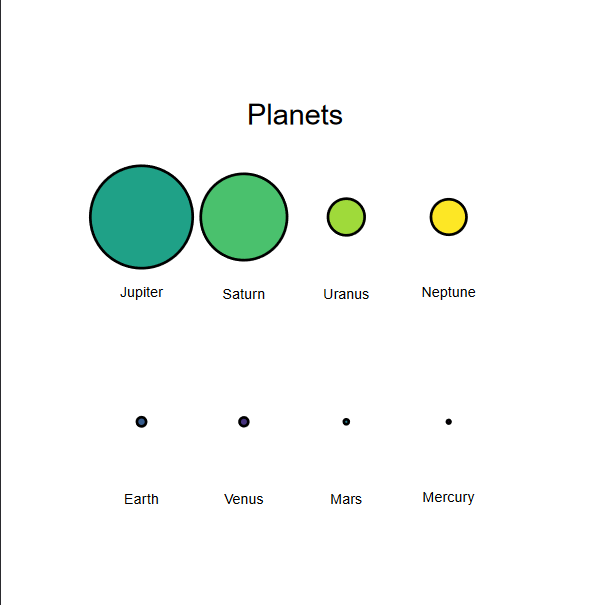
circlesplot(cp_vals=diameter, cp_text=planets, cp_max=4L, cp_color=viridis(8), cp_title="Planets", cp_title_size=2)NOTE: Both parameters are optional. If you leave them blank, cp_title will be left blank and cp_title_size will be set to 1.5.
Order
If you want to automatically order your results, you can set the cp_sort-parameter. Per default, it is set to ‘none’. But you can also set it to ‘asc’ (ascending) or ‘desc’ (descending):
circlesplot(cp_vals=diameter, cp_text=planets, cp_max=4L, cp_color=viridis(8), cp_title="Planets", cp_title_size=2, cp_sort='desc')Circles
You can modify the line width / thickness of the circles with the cp_line_width parameter:
circlesplot(cp_vals=diameter, cp_text=planets, cp_max=4L, cp_color=viridis(8), cp_title="Planets", cp_title_size=2, cp_sort='desc', cp_line_width=3L)NOTE: The cp_line_width parameter is optional. If you leave it blank, it will be set to 2L.
Tight Spacing
As you can see in the final Result, the spacing between rows is set optimistically. If you want a tighter layout, you can use the parameter cp_tight_spacing. It is a (numeric) number between 1.0 and 2.0. A spacing of 1.0 will maintain the current graph spacing. A spacing of 2.0 will result in a very tight layout.
circlesplot(..., cp_tight_spacing=1.3)Shapes
The default plot consists of circles. If you want, you can also set the parameter cp_shape to ‘square’ to draw squares instead of circles.
circlesplot(..., cp_shape='squares')Return value
The circlesplot-function returns a recordedPlot-object. Therefore, you can save a plot to a variable and later plot the circlesplot:
cp <- circlesplot(cp_vals=diameter, cp_text=planets, cp_max=4L, cp_color=viridis(8), cp_title="Planets", cp_title_size=2.5, cp_sort='desc', cp_line_width=3L)
# ...
cp
Exporting
You may observe that the output in RStudio lacks some quality, especially the rounding of the circles. If you export it as png-file, it will stay like that. The recommendation is to export the plot as a pdf-file which has better quality.
ATTENTION: You may see something unexpected in RStudio: When you create the plot and it is displayed in the lower right window (in the plots tab), it seems like that a part of the plot is cut off but this happens only due to the size of the lower right window. Either resize it or use the following R-code to save the plot as pdf:
pdf("path/to/your/pdf/plot1.pdf")
circlesplot(cp_vals=diameter, cp_text=planets, cp_max=4L, cp_color=viridis(8), cp_title="Planets", cp_sort='desc')
dev.off()
Help
If you need help, want to report an issue or request a new feature, please visit Github.
